
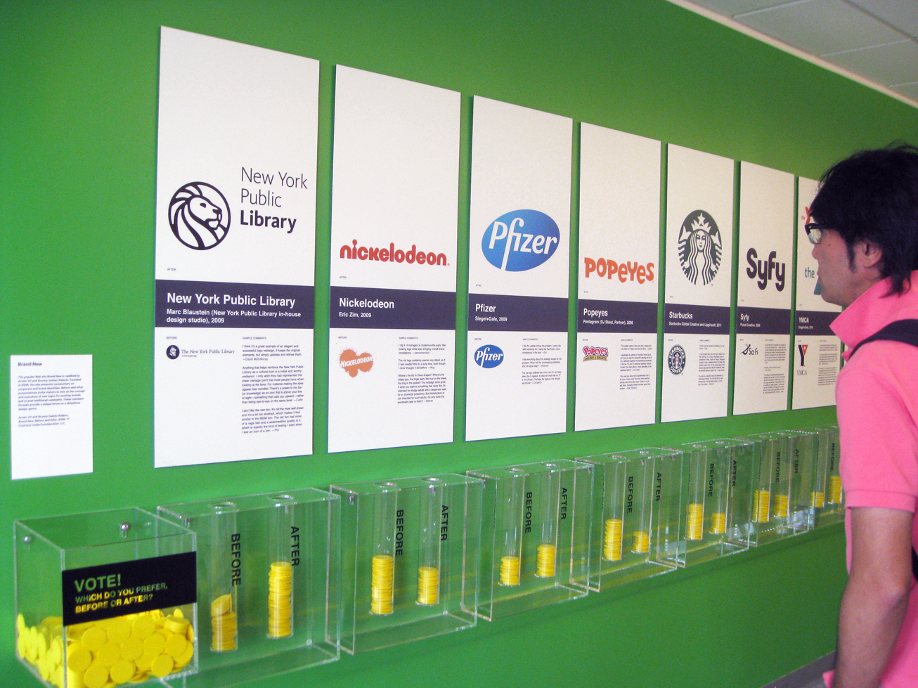
Governors Island, NEW YORK—New logos for the New York Public Library, the YMCA and Pfizer are winners, but the revamped brand identities for a coffee powerhouse, cable channels and a fried chicken franchise didn’t fare so well. One of the displays at the new “Graphic Design: Now in Production” exhibit on Governors Island encourages visitors to vote on whether logos for major organizations and companies are more appealing before or after their redesign. Yesterday, visitors to the show co-created by the Cooper-Hewitt National Design Museum and Walker Art Center thought the original logos for the major cultural brands—Starbucks, Nickelodeon, the SyFy channel and Popeyes—were more successful.
The show also explores “some of the most vibrant sectors and genres of graphic design today” and how technology has influenced the field. Displays highlight the latest in typeface design, information graphics, entrepreneurial efforts to make designer goods and branding programs. All the work is relatively new, created since 2000. Trends in book and poster production are examined. Work by Albert Exergian stands out: his graphic posters feature mimimalist interpretations of TV shows—a glass of scotch for “Mad Men,” a surveillance speaker for “The Wire,” talking clouds for “In Treatment,” a dime bag of marijuana for “Weeds.” Other installations showcase new approaches to magazine development (in print and online) and innovative film and television titling.
“Graphic Design: Now in Production” is on view May 26 to Sept. 3, 2012 in Building 110.
All photos by Arts Observer

Above, “Graphic Design: Now in Production” explores the latest in graphic design today. Top of page, Inspired by Brand New, a website about graphic identities, an interactive display invites visitors to use yellow chips to vote on whether branding for various entities is better “before” or “after” the redesign of their logos.

Above and below, “For the Birds, 2010-11 by Jeff Canham and Luke Bartels is a series “avian establishments for urban birds.” The architecturally inspired storefront birdhouses feature a tattoo parlor that pierces beaks and a mortuary that accepts major credit cards. In the background, wall coverings by KnollTextiles feature graphic patterns created through collaborations with notable graphic designers.


“Set Top Box,” 2010 by Justin Manor, John Rothenberg and Eric Gunther, courtesy of Sosolimited, a Boston-based design and technology studio. The real-time project uses closed-captioning from television programs to create dynamic typographic animations.


“The True Size of Africa,” 2010 by Kai Krause, shows that the geographic scale of Africa is monumental compared to the world’s most powerful nations—including the United States, all of Europe, China, India and Japan—which would all fit within the boundaries of the continent.

“T,” the New York Times style magazine, reinvents its logo to complement special issues. From left to right, Logo designs by Stephanie DeArmond and Blu Dot.

“Untitled Test Prints, 2002-2007 by various artists at Aesthetic Apparatus, a Minneapolis-based design studio, founded by Dan Ibarra and Michael Byzewski, that makes “gig posters.”

This collection of “Felt-Tip Prints,” 2011 by Daniel Eatock was created by placing a sheet of paper atop 148 uncapped felt tip pens until all the ink was drained from them. The artist then rotated the sheets and rearranged the pens up to 10 times to complete the works whose spots “overlap, collide, mix and align, forming constellations of color.”
[…] recently read via Arts Observer that visitors to the “Graphic Design: Now In Production” exhibit in New York overwhelmingly expressed their love for famous logos prior to their […]